Romanson is South Korea’s largest watch manufacturer today. When VIEWSDESIGN was commissioned to create a comprehensive Corporate Design Program, the logo looked like this.
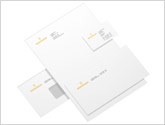
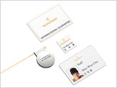


Using both Hangul and English alphabets, we designed corporate stationery, including business cards, letterhead, various-sized envelopes, memo pads and other collateral. Identification material extended the range of stationery.
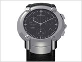
We extended the brand by creating several sub-brand logos and a range of watches.
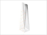
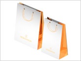
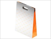
VIEWSDESIGN took great care in designing the packaging to ensure that it reflected the international look of Romanson. Shopping bags, gift bags, product cellophane bags, presenters, displays were all integrated into a system.
For readability in the company’s home country, one version of the logo had to be in Hangul, the Korean alphabet. With a nod to its important export markets, Arabic and Japanese versions were added.
The goal was to create a more international looking logo, evoking the modern enterprise which Romanson had become. The two founding partners, working together for business success, were to be represented in the logo.